
As a wheelchair rider, I often encounter problems at service counters. Sometimes it's a design shortcoming, but often it's a management issue that crops up after final inspection. The CBC defines four related counters: service counters, check out aisles, point-of-sale devices, and dining surfaces. Let’s look at some common problems, and then talk about how architects can prevent them.
Design Issues
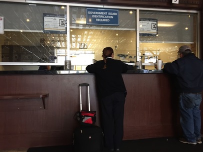 |  |
| Here's a service counter at an Amtrak station I was at recently. A tiny accessible counter is on the left, but the agent can't see it or reach it, so there’s no place for an actual transaction between a wheelchair riding customer and the agent! | Here's what it looked like to use from my point of view. Pretty useless. |
Maybe the designer thought just having a check-writing spot was good enough, but that’s not the code’s intent. This was clearly a design problem for the architect to solve.
How about this Clipper Card kiosk at the Powell Street BART, with (amazingly) no low counter at all? And the sloping face makes it even more difficult to interact with the employees behind it.
How about this Clipper Card kiosk at the Powell Street BART, with (amazingly) no low counter at all? And the sloping face makes it even more difficult to interact with the employees behind it.
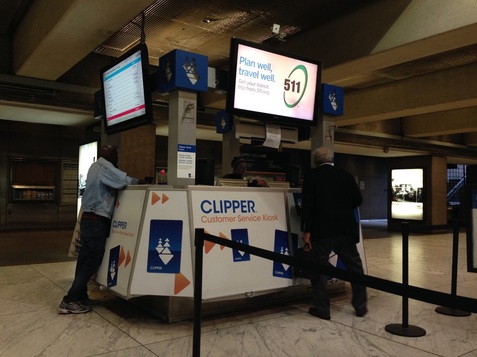
It's brand new, and apparently the kiosk designer didn’t know the code. If you, as architect, show a counter or point of sale location on your drawings, note that it must be accessible, so that the fabricator has guidance.
Usage & Maintenance
A more common problem is that the accessible portion of the counter is pushed to the side, or tacked onto the 'real' counter. So employees think it’s for them, and they clutter it up with cutlery, napkins, recycling bins, and more. Some examples:
 |   |
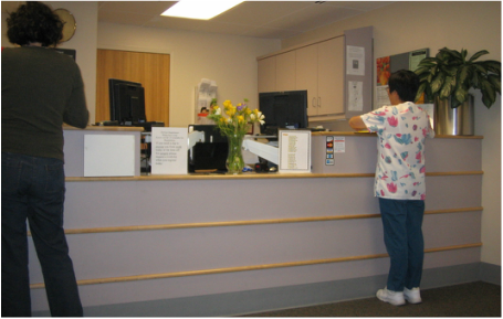
And here's a counter at Kaiser Permanente's Oakland hospital. Of all places, you would think that hospital staff would have accessibility in mind! I wound up doing my transaction by reaching between a vase of flowers and the back of a computer screen. Not cool.
The ADA and the California Building Code require that owners and operators ensure “maintenance of accessible features.” But if employees don’t know something’s an accessible feature, how can they maintain its availability?
I’ve asked many dozens of employees whether they know why the counter is there, and maybe 5% do. I recently found a rare uncluttered low dining counter at a restaurant, but three employees insisted that it was for take-out use only, and that I couldn’t sit there. I prevailed after an unpleasant debate, but the restaurant probably reverted back when I left. It shall remain nameless, but let's just say it was a pizza kitchen in California.
Solutions
So there are two things the architect can do:
First, design the accessible counter so that it is experienced from the employee point of view as space for a transaction. Here's a great counter at Berkeley’s Ed Roberts Campus:
First, design the accessible counter so that it is experienced from the employee point of view as space for a transaction. Here's a great counter at Berkeley’s Ed Roberts Campus:
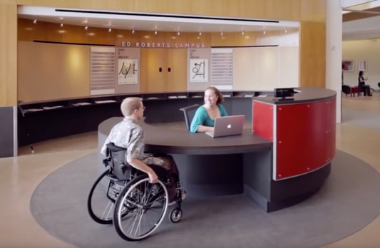
High and low areas have equal dimensions, the employee can alternate sitting and standing for comfort, the purpose is clear, and it welcomes everyone.
Second, wherever the purpose of the space could be ambiguous, you can add signage like this to clarify it:
Second, wherever the purpose of the space could be ambiguous, you can add signage like this to clarify it:

This idea of instructional signage is useful in many places. In accessible restrooms (that often become storage rooms) I put signage saying “No storage permitted within this accessible restroom, except if located higher than 80” above the floor.”
Instructional signage is being discussed for a future version of the CBC, but as architects who want our well-designed accessibility features to actually be available to the people who need them, we should be proactive and place signs like these in our buildings. This gives employees - and the people who need the features - a fighting chance.
Instructional signage is being discussed for a future version of the CBC, but as architects who want our well-designed accessibility features to actually be available to the people who need them, we should be proactive and place signs like these in our buildings. This gives employees - and the people who need the features - a fighting chance.
 RSS Feed
