• ARCHITECTURE
    • Homes
    • Multi-Family
    • Universal Design: Beauty Personified
    • Commercial Projects & Site Planning
    • Details
    • Drawings
  • Ideas
    • Universal Design >
      • Universal Design Ideas
      • Universal Design Links
    • Ecological Design
    • Videos
    • Articles
    • Resources
  • About Us
    • FAQ
    • Who We Are
    • Why We Are
    • It Takes a Team
  • Contact
    • Contact Us
  • Blog
  • Employment
  • 510-540-7111
Mikiten Architecture

Shelteraging In Place

9/1/2020

3 Comments

 
Picture
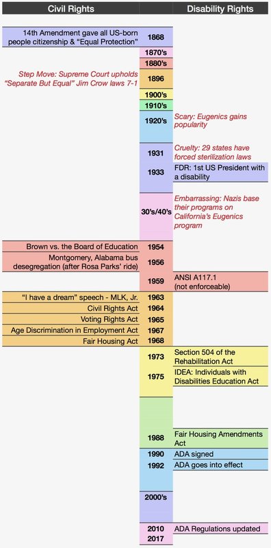
Maybe the portmanteau “Shelteraging” In Place doesn’t roll off the tongue, but it serves our purpose here to consider how Sheltering in Place can give us a new perspective on Aging In Place, and by extension, Universal Design. 

We’ve all lamented the ways Shelter In Place orders have stifled our freedom. In the uncertainty of Shutdown Week Two, a client mourned the ability to hop in the car to get milk, walk the streets for fresh air, or socialize. 

Her statement struck a chord: These are limitations are routine for people with disabilities and many of our elders. Most of us will experience limitations and increasing isolation as we retire and age. The impediments in these cases are not a virus that we’re unable to battle, but the built environment that we can change.

As a wheelchair-riding architect I can relate. Growing up with a weak bone condition, I spent many 6-week stretches of my childhood in traction with broken bones. Not only did I not go outside, to the store, or to see friends, but I stayed in our living room the whole time. These stay-at-home orders feel peculiarly familiar.


In my homebound stretches, I felt invisible to the world. There was no social media or cell phones, and our landline phone was out of reach on the kitchen wall. Once I healed and got out of traction, I needed help to go almost anywhere - the built environment of the 1960’s and 70’s didn’t exactly say “come and join the rest of us”.

The COVID-19 pandemic has made people invisible to each other in a similar way.  

When we venture into the subdued public realm these days, there’s an eerie sense of emptiness combined with a feeling that behind all these quiet facades there are families and roommates huddled together, waiting, not daring to go outside. Their presence is palpable. 

Yet in “normal” times of bustling street life, there are still many people behind those quiet facades to whom the built environment extends no invitation to join public life. Out of sight, they are too easily out of mind.

Some are the elders of our community who retire, gradually go out less, develop mild and then more severe disabilities, and for whom even going to that favorite neighborhood restaurant becomes too much of a chore. Some are people with disabilities for whom the unpredictability of accessibility in cafes, restrooms, and stores keeps them from adventuring out.  

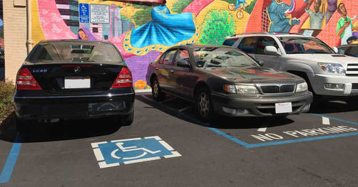
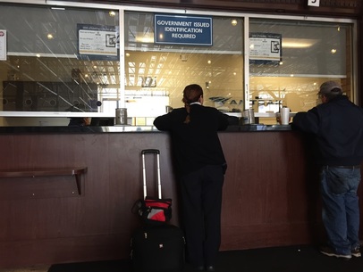
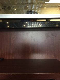
Lest we think the ADA has fixed the public realm, know that even in California, at the supposed leading edge of accessibility, we have a long way to go. I made birthday lunch plans at a highly recommended restaurant in SF this year. We called ahead to confirm accessibility, especially since my son was also temporarily using a wheelchair after a car accident. We got there and found three steps at the front door!

Picture
Picture
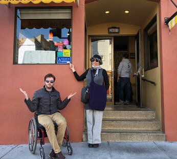
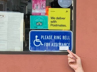
Their idea of “access” was having a sign and a bell (mounted at about 63 inches no less!) to ring for help and have someone carry us inside. This is 29 years after the ADA, folks. We rang the bell, scolded the manager, and went elsewhere. This is not a rare event.

But people are also stuck in their own homes. Clients of ours with MS and other conditions have gone from ambulatory to using a wheelchair within the span of a year or two, needing elevators added to their homes and bathrooms and kitchens remodeled. They become increasingly invisible to their friends, and increasingly alone. Their physical abilities changed, but it’s actually their houses that “dis-abled” them.

Defining disability is contextual; millions of us are being temporarily disabled by COVID-19’s presence in the environment, but steps, inaccessible checkout stands, and unusable restrooms disable about 34 million Americans every day. When the pandemic lifts, the disabling conditions of the built environment will still be there.

Architects can’t make a COVID vaccine, but we are the most powerful people in the world when it comes to changing the built environment. Here are three ways we can start to fix things: 

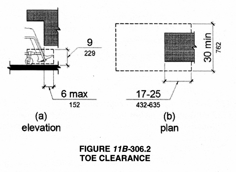
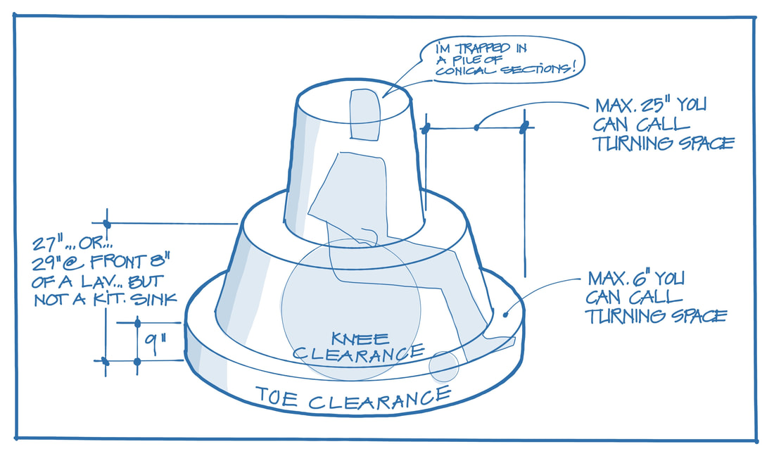
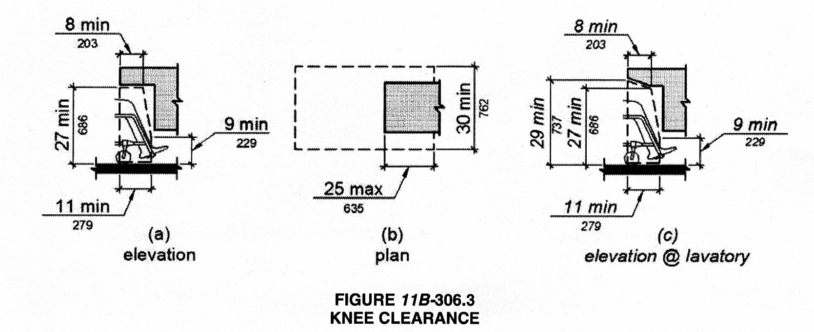
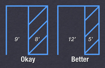
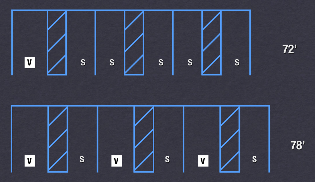
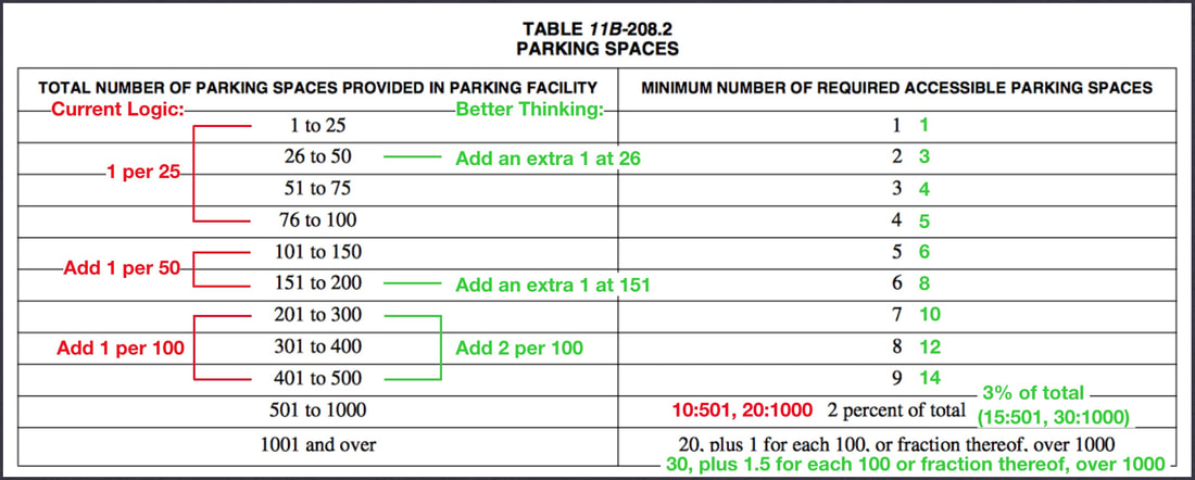
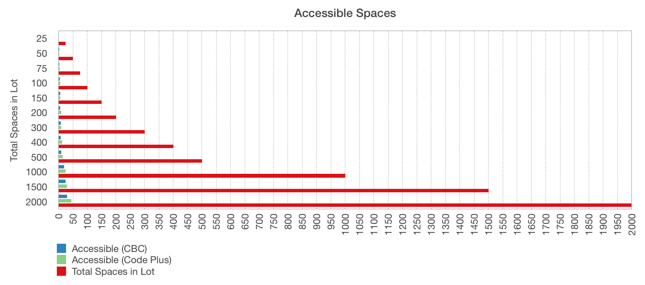
1. Round up for access. Architects often ask me how they can design for better access without special expertise in disability. Fair question.The simple answer is that when in doubt, focus on quantity. The amount of time I’ve sat in nearly empty 5-stall restrooms, waiting for the ambulatory occupant of the single accessible stall to finish is insane, including at the AIAEB offices and especially at airports and stadiums. A few feet for another accessible stall, included at the beginning of a project, would serve not just people with disabilities, but parents with kids and strollers as well. And if it’s a bonus stall, it doesn’t have to be a “perfect” accessible stall - just add what ever space you can. There are plenty of people with walkers or more compact wheelchairs like mine for whom a four-foot-wide stall with grab bars would be a welcome second option. The Baby Boomer wave is aging, so the number of accessible theater seats, parking spaces, and accessible stalls needs to increase too. Most standards we use date back to demographics research from the 1950s-1970s. So figure out how many of a component you need by code, and then round up. You’ll be surprised how easy it is to make this work during Schematic Design.

2. Come together as a profession to promote Universal Design Ordinances. Alameda adopted one, Berkeley is working on it, and many other Bay Area cities are considering it. Sometimes these apply to tract homes (requiring things like zero-step entries), sometimes to multifamily and commercial developments (requiring more accessibility than the California Building Code and ADA do), and sometimes they encompass the public realm, improving wayfinding, safety, and flexibility on streets and in parks.

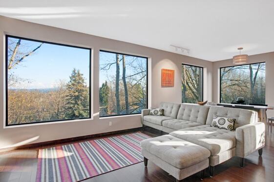
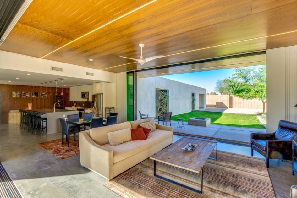
3. Focus on homes. Sheltering in place is revealing how our homes accommodate us - or fail us. Take the opportunity to promote ideas about aging in place. Our residential clients are a captive audience right now, and we can help them future-proof their homes. Remind them that they will be home full-time again as they retire and age. Let’s make those homes comfortable, accommodating, and easy to enter and exit. Think of how escaping the stress of The Shutdown with a cup of coffee in the morning sun of our rear decks can bring profound joy these days. Let’s make sure those simple and deep experiences are always available for people.

The economy will reopen. Architects can learn from our COVID-19 isolation by not forgetting the invisible people who want and deserve a chance to enjoy and contribute to our shared world. We can make a more equitable environment by opening buildings to everyone. We can’t change COVID-19, but we can change the world - and inoculate ourselves against disabling conditions - with the next project that hits our drawing boards.

Do these things and you’ll also be doing your Future Self a favor, since one day you’ll be the 80-year-old retired architect, sitting behind that quiet facade, wanting to feel accommodated and welcome when you go out. Take design action now and you’ll thank yourself later for a world that says “come and join the rest of us”.
3 Comments

Building a New House with Limited Space

7/10/2020

33 Comments

 
Trying to build a new house from the ground up can be a daunting but rewarding task. One of the biggest advantages of building new is the ability to design everything to your exact specifications. However, sometimes design plans are hindered by the amount of space you have to work with. When building on a restrictive plot of land it can be difficult to ensure that you are getting the most out of your home and your land. That’s why we’ve reached out to the experts in home design from Portland to Philadelphia to provide you with ways to optimize the design and layout of your home when working with limited space.
Picture
Know exactly what you want
When designing a house with limited space, a conversation on a homeowner’s vision for efficient living needs to be had with the architect before starting the design process. This is so appropriate design goals that support this vision can be organized. A designer can use the wall cavities for storage, raise the ceilings to provide clerestory light, fabricate custom built-in furniture fit to small dimensions and employ other design tricks but if there is not the preexisting appetite for simplicity and efficiency by the homeowner then it will not be possible for the architect to turn a house’s limited space into unique design opportunities. Rooms tend to get bigger with each design review by the homeowner in a residential project if the homeowner does not hold onto a succinct vision supported by specific efficiency goals. An architect experienced in energy efficiency, construction and interior design will be able to organize appropriate design goals with a homeowner’s vision for living with less. Nick Dean Architect

Read Between the Studs 
It’s standard to recess a medicine cabinet between wall studs, but why not take advantage of that “free” space elsewhere? For small bathrooms, we’ll often put a tall cabinet recessed in the wall that’s great not just for medicine, but for all those other small items you want in the bathroom, or the six bottles of shampoo you bought on Amazon, but don’t have space to store elsewhere in your small house. And if your wall is framed with 2×6 studs rather than 2×4, that cabinet can even hold rolls of toilet paper. – 
Mikiten Architecture


Build Vertically
It’s not unusual to see three, or even 4-level homes that make great use of interior glass, open staircases and strategic layouts. Many companies now offer residential elevators that take up surprisingly little square footage, and the breezes and views from that top floor can be amazing! Don’t be afraid of a nontraditional floorplan. A talented designer or architect can even make a triangular room work for your lifestyle. Additionally, be sure to shop for appliances and furnishings carefully. Many top-tier brands now offer down-sized ranges, refrigerators, and furniture that fit a more compact, urban lifestyle without having to sacrifice quality. – Modern Architecture + Design Society
Picture
Have an architectural program ready
Right-sized homes don’t happen by accident. They come about through thoughtful planning and design. To fully realize the potential of a small plot of land it’s important to begin with a careful study of your space requirements. In the world of architectural design, this is commonly referred to as an “Architectural Program”. It’s a specific and complete list of your space requirements. In the hands of a skilled architect, this list will form the foundation of a design that’s both space-efficient and inspirational. – Harry Hunt Architects

Make your home work smarter with dual-purpose spaces
When you are confronted with the dilemma of limited space it requires you to be more creative with circulation and room usage. You may need to provide rooms that will provide a dual purpose such as a study/family room or kitchen with island seating which would be your breakfast area. If your kitchen is very tight you may consider a corner banquette seating. It takes some squeezing to get situated but it saves floor space. Furniture may need to be oriented to allow circulation through a room eliminating hall space. Bedroom furniture such as bunk beds or raised beds with a desk below are also space savers. An office can also serve as a guest room by providing a pull-out couch. – Aric Gitomer Architect

To make the most of your limited space, design with a dual purpose. Most homeowners seldom use their foyer as the main entry. Instead of leaving the space unused, turn it into a functional area such as a home office. Staircases are also prime real estate that can serve multifunctions. Consider a stacked, exposed staircase, and tuck a wine cellar or reading corner beneath the stairwell, for total optimization. – John Lum Architecture

To make your home work smarter due to space constraints, design your bathroom as a spa-experience versus a utilitarian space. Rain head showers and deep soak tubs can turn a bath into a spa. Also, rethink the sink. Ask yourself, do I really need two sinks and all that plumbing? Negative space can make a bathroom feel bigger. Combined with an open plan kitchen which extends the room while removing the boxed-in feeling, a small footprint can have maximum living (and resale) value. – Studio SHK
First, minimize the impact of vehicles on the square footage of the lot.  Limit area devoted to circulation and combine uses when possible.  Bring in views with expansive floor to ceiling glass to increase the perception of the area by leading the eye beyond the walls. – Mark A Silva Architect
Circulation is key

​It’s all about circulation. Old houses tend to be compartmentalized; the easiest thing is to remove doors that remain open most of the time. When I remodel an old house I look at space that is eaten by pathways. By opening the dining to the kitchen will make your kitchen more useful and bigger. – De Meza + Architecture Team

Narrow or constrained lot sizes can be a challenge when designing a new home, but can also result in unique, carefully designed and beautiful spaces.  H2D Architecture + Design approaches space constraints with thinking about a design that flows efficiently and graciously between the spaces horizontally and also vertically between the floors.  Open floor plans which combine uses, such as living, dining and kitchen areas, help to reduce the need for extra circulation spaces, as well as utilizing open stairs between floors in the design can help create the feel of a larger space. – H2D Architects

Let there be light
Light is essential when dealing with smaller spaces. A well-lit space can give the impression of largeness without the actual footprint size.  Large glass walls taken from floor to ceiling to adjacent walls can allow for small spaces to open up visually and connect to the outside.  Accordion doors are a favorite product to physically open up the interior space to exterior living.  On restrictive lots, tall garden walls provide privacy and intimacy even in the face of density. – Tomecek Studio Architecture

​
Picture
Large covered porches, accessed by quad-slider doors (which open up 6ft in the center) can make a small home live dramatically larger.  An open floor plan with high ceilings (9-10ft) can also help make a house feel larger than its square footage.  Lastly, if we’re constrained in size, we emphasize quality over quantity – this shows up in “Not So Big House” ideas such as extra built-ins to keep everything organized and uncluttered. – Rodwin Architecture and Skycastle Construction

Less is more 
As the partner of an architectural practice in London for many years, high property costs meant space was always a premium and forced us to become experts in designing homes with limited space both inside and out. Since returning to the US, I often rely on this knowledge. Limit material selections and the rooms will flow as one. Keep spaces flexible – double or triple their function and always design them to accommodate change in the future. Design houses with seamless transitions from inside to out, utilizing large floor-to-ceiling doors and windows and importantly if the same floor finish inside continues out to open-air spaces, i.e. patios or covered porches, the room will effortlessly extend out and feel much bigger. There are many great tricks a good designer can and will use to make limited space feel grand. – Architecture Joyce Owens

When working with small spaces keep materials to a minimum, using the same materials on the floor throughout your rooms.  When choosing wall colors, pick colors that reflect light. Your furniture should have multiple uses and be lighter in weight where they can be easily moved from space to space when needed. – Streamline Architects

Take advantage of 3D modeling
It’s hard to optimize the rooms in your home without being able to visualize the spaces beforehand. By modeling in SketchUp, you can get a good sense of space in 3D, rearrange furniture to test different layouts, experiment with different materials & textures, and design for the space you have. You can also go up! See what your small footprint would look like as a two or three-story building! – SketchUp

Optimize unused space for storage
Many times issues of space ultimately affect precious home storage. As a result, consider clever ways to maximize the space often allocated to essential design features. For example, a staircase’s rise and run create a unique storage opportunity that is often wasted. In the past, I have made each stair act as a drawer. – Larry E. Boerder Architects

Avoid double-height rooms
First, avoid double-height rooms, it takes up a large portion of your buildable area. Instead, go with taller ceilings throughout. Second, carve out exterior basement rooms, it creates more unique spaces and extends the basement space for those beautiful warm nights. They’re also great for direct access to and from the backyard if you plan on having a pool. – RS Mannino

Fluid indoor and outdoor spaces
Designing beautiful and useful homes while optimizing limited space is our core strength at D3 Architects. We always talk to clients about making sensible, connected spaces and not throwing away money on finishing wasted space. This thought process begins with the site or the outside.  Consider two things in particular: the orientation of your spaces to daylight (the qualities of daylight are different from the N, S, E, and W) and the connections to the outdoor spaces you will use. After that, the most important thing is thinking about flows of movement.  Consider how you will move around your house, say from the entry to the kitchen, and then the movement within each space, for example, how you would ideally like to prepare a meal in the kitchen, moving from the stove to the refrigerator to the sink, all while being able to keep an eye on the kids playing outside. If you map these relationships out thinking about your own family’s priorities, living in your home will always be a pleasure. – D3 Architects

Picture
Know exactly what you want
When designing a house with limited space, a conversation on a homeowner’s vision for efficient living needs to be had with the architect before starting the design process. This is so appropriate design goals that support this vision can be organized. A designer can use the wall cavities for storage, raise the ceilings to provide clerestory light, fabricate custom built-in furniture fit to small dimensions and employ other design tricks but if there is not the preexisting appetite for simplicity and efficiency by the homeowner then it will not be possible for the architect to turn a house’s limited space into unique design opportunities. Rooms tend to get bigger with each design review by the homeowner in a residential project if the homeowner does not hold onto a succinct vision supported by specific efficiency goals. An architect experienced in energy efficiency, construction and interior design will be able to organize appropriate design goals with a homeowner’s vision for living with less. Nick Dean Architect

Originally posted on Redfin
33 Comments

Toeing the Line

9/17/2018

0 Comments

 
It happened again. I recently got an email in which the sender wrote “tow the line”. Then, minutes later, someone asked me why the code has maximum toe clearance dimensions. Let’s clear up both toe problems once and for all.
First and more importantly (bad grammar is so irksome, isn’t it?), it’s “toe the line”. Don’t confuse it with nautical tow lines…it’s about feet. The phrase originated with soldiers lining up in the military or runners in track and field events, where officials would call out “Toe the line!” to get the runners ready. Either way, it’s the digits of the feet, lined up in a row, like this:

Picture
Although I’m glad to talk about this little phraseological pet peeve of mine, not many people ask me about it, but many DO ask me about the other toe line: The area under a sink or other element that provides space for a wheelchair rider’s toes and foot rests. Here’s the toe clearance diagram from the Americans with Disabilities Act (ADA) and California Building Code (CBC):

Picture
And what confuses many people about it is that the toe clearance is 6” max. People ask “Why not give more space for people’s toes?” That’s fine, I say. Toes deserve all the space we can give them. But despite Figure 11B-306.2 (above) looking like a counter or implying a lavatory, the code is referring here to maneuvering space; it’s telling you the depth of toe-level space you can include in the 60-inch “Circular Space” as defined in 11B-304.3.1. (By the way, this is what most people just call turning space…or very inaccurately call “the 60 inch turning radius”. Another pet peeve of mine…that would be a 120 inch diameter!)

Here’s a diagram that’s more helpful for thinking about the turning space. Imagine this pile of forms sliding in and out of a restroom, kitchen, work areas, etc. That’s where the 9 inch high, 6" maximum  depth toe space (and the corresponding 27” maximum knee space height) should be applied.

Picture
The following is how the code describes this in CBC Chapter 11B-306.2.4 (but since there are no accompanying figures, it’s usually overlooked):

“Space extending greater than 6 inches (152 mm) beyond the available knee clearance at 9 inches (229 mm) above the finish floor or ground shall not be considered toe clearance.”

​This says "available" knee clearance. In my opinion, if you don't have an obstruction limiting the knee clearance, you can claim more than 6" of horizontal toe clearance.

Bonus Tip: A lavatory is not a sink…

A related confusion is that the CBC differs from the ADA in sinks. We have these two definitions (Chapter 2) in California:

LAVATORY. A fixed bowl or basin with running water and drainpipe, as in a toilet or bathing facility, for washing or bathing purposes. (As differentiated from the definition of “Sink”.)

SINK. A fixed bowl or basin with running water and drainpipe, as in a kitchen or laundry, for washing dishes, clothing, etc. (As differentiated from the definition of “Lavatory”.)

So whereas kitchen sinks and work counters need to have the clearances shown above, a bathroom lavatory in California needs a thinner front edge, to allow for more ability to get in nice and close. To remember this, picture someone in a wheelchair washing their face in the bathroom - they need to get in closer than when they’re reaching out and washing dishes in a kitchen sink.
Here’s the CBC figure showing the lavatory toe space requirement - figure (c):
Picture
The requirement is for 29 inches clear at the front of the lavatory. Since the maximum top-of-lavatory dimension is 34 inches, this results in a sink that’s at most five inches high at the front. This is a very difficult requirement to meet with a wall-hung sink; probably 95% of the ones on the market that say they are “ADA Compliant” have a front edge that’s over five inches tall. So beware those little wheelchair symbols on cut sheets! They often don’t work in the Golden State!


Duravit, Wet Style, and Barclay have California-complying sinks, and with great contemporary designs to boot (including some by Philippe Starck), and many have drains in the very rear, which is a plus for added knee space:
Picture
It’s temping to just do a countertop with a shallow bowl in it to meet the depth requirement. Resist this in high-use public restrooms, because the countertop inevitably winds up splashed and perennially wet. Not only does this look messy, but it’s a nightmare for the sleeves of people using wheelchairs, shorter people, and kids. But if you must, set your countertop below 34 inches so that if the undermount sinks you specified wind up being value engineered out during construction and replaced with self-rimming ones, you don’t wind up out of compliance…the required 34” maximum measurement is to the sink rim, NOT the countertop.

As I always say, we should take any opportunity to provide MORE space than the code minimums require. If you can provide more knee space, then someone in an electric wheelchair with a joystick out front, or someone in a high-seated scooter who pulls up sideways and needs more knee space when they turn their seat 90 degrees is going to thank you. Who knows - that might just be you or a family member one day. So let’s make better, more flexible architecture…and not just toe the line.
0 Comments

Ratchet Up Your Parking

8/10/2018

0 Comments

 
The way I look at it, if we exactly meet the Americans with Disabilities Act (ADA) and California Building Code (CBC) minimums in our designs, we’re barely avoiding “breaking the law”. And with that “perfect” code-compliant design, one small mistake in the field and we’re losing money and sleep solving problems in construction administration.
That’s why I advocate Code Plus design. Give an extra few inches as a safety margin and you’ll be doing your client, the contractor, and yourself a favor!
The code and the ADA are minimum standards based on extensive negotiations between people with disabilities
and building owners associations and big developers. Guess whose agenda is better represented in the docu- ments we’re following?
Here are three ideas for you to take to the street (well, parking lot) in your projects. They will make the lives of your users much better - with barely any impact on square footage and cost.
1. Access Aisle Size
Here’s an easy one: CBC 11B-502.2 Allows van spaces to be 9 feet wide with an 8 foot access aisle or 12 feet wide with a 5 foot access aisle. Either way, it's 17 feet total width, but one is better than the other.
Picture
Why? Because wide aisles are just too inviting for other drivers, and this happens:
Picture
So stick with the narrow five foot aisle, and give the remaining three feet to the van space itself.
2. Number of Van Accessible Spaces
I recently had to use an electric wheelchair for four months, and rented a van with a ramp. I was blown away to discover how many places I couldn’t deploy the ramp. Trees, bushes, signs, bike racks, and newspaper boxes
made many street spaces impossible. Regular accessible stalls with five foot access aisles often wouldn’t work, and I’d circle parking lots for 20 minutes until a usable van space opened up, or just give up and drive away.
So...what if we made EVERY accessible space left of an access aisle a van space rather than a regular space? Surprisingly, in a parking lot with 200 spaces, that would add only six feet to the lot:
Picture
This shows the CBC Chapter 11B requirement for one van space per six required accessible parking spaces (it’s one per eight for housing under Chapter 11A).
In a double-loaded lot of about 55,000 SF, that’s only 108 SF of added space. I defy anyone to show me a 55,000 SF lot that I can’t squeeze another 108 SF out of. Put another way, that’s a unnoticeable 0.02% difference in most people’s experience, and a 100% better experience for people who need these spaces.
3. Number of Accessible Spaces
Imagine you have a green car and drive into a 200-space lot, but only 12 spaces are for green cars. There are 60 spaces empty around the lot, but all the green-car spaces are taken, and you can’t park anywhere. Wouldn’t that be dopey? Completely - and that’s what it feels like to people who need the accessible spaces. But this is easy to fix...
The CBC sets the required number of accessible spaces in Table 11B-208.2, based on total spaces. Here are the code numbers in red and black, with my suggestions in green. These are tiny changes, but will offer huge im- provements in real-world usability:
Picture
Here’s a graph of these changes, showing what a minute change this is:
Picture
Many of the accessibility numbers in the code were established in the 1970’s and 1980’s (with some dating back to first ANSI A117.1 of 1959), when the percentage of people over 70 was about half of what it is today...and that number is in the process of doubling between 2010 and 2030.
Add to that the fact that many people with disabilities were stuck in their homes due to lack of today’s advanced mobility aids and the lack of an accessible public environment (not to mention many people being institutionalized), and it’s quickly clear that these numbers need to be updated. It will take a long time for the glacial ADA and building code update processes to catch up.
In the mean time, it’s up to us to up the ante and create better places that reflect the reality of what the population needs. If we don’t do it, who will?
0 Comments

A Social History of Accessibility

2/6/2017

3 Comments

 
Ever wonder how accessibility requirements and the ADA came into being? It was a long and sometimes terrifying journey, inspired Civil Rights struggles, that led to the ADA’s vision of full inclusion for all people.

The 14th Amendment and  Eugenics
A long and ugly history preceded any legal protection for people with disabilities (see the timeline  I put together at the end of the article). The 14th Amendment gave citizenship and “Equal Protection” to all people born in the US…way back in 1868! Yet in the 1920’s, the Eugenics movement spread around the globe. Francis Galton analyzed the intelligence of England’s upper classes and determined that “it would be quite practicable to produce a highly-gifted race of men by judicious marriages during several consecutive generations”. 

That might sound innocent, but the Eugenics Record Office in Long Island collected data on “undesirable” physical and intellectual traits, and by 1931, 29 states had sterilization laws that allowed doctors to “eliminate negative traits.” This resulted in the forced sterilization of 64,000 US citizens. It started with people with disabilities, expanding to people committing “crimes” like promiscuity or poverty. No Equal Protection there!
Picture
The chilling poster here is just one example of the movement’s propaganda. Germany actually worked with California in the 30’s to learn about formalizing Nazi social cleansing programs.

The Civil Rights Act and Class Status
It was 86 years after the 14th Amendment that Brown vs. the Board of Education finally abolished racial segregation in schools, and another ten before the Civil Rights Act gave deeper protections.
One legal legacy from the Civil Rights Act is “Class Status”. This defines a group and enables the government to establish protections for the members. These applied to race, color, religion, national origin, sex…but nothing to people with disabilities. 

It wasn’t until 1973, 105 years after the 14th Amendment, that Section 504 of the Rehabilitation Act required equal treatment of people with disabilities…but only for federally-funded programs. So for two decades after the Civil Rights Act, people with disabilities could still be legally marginalized. It wasn’t until 1988 that the Fair Housing Amendments Act established people with disabilities as a Protected Class, and laid the foundation for the ADA.

Picture
Separate Is Not Equal
This photo of people protesting against inaccessible public transportation is one of my favorites. One sign reads “I can’t even get to the back of the bus”. Disability Rights protests proliferated, modeled on the Civil Rights movement, with sit-ins, building occupations, marches, and people chaining themselves to buses, demanding equal treatment.

This highlights the Separate But Equal concept that Oliver Wendell Holmes’s Supreme Court in 1896 said was ‘good enough’. The resulting Jim Crow laws formalized segregation until 1954’s Brown vs. Board of Education desegregated schools. And to think…I attended Holmes High School in Texas without knowing this. Ugh.

Picture
Unfortunately, Separate But Equal sowed an idea that still has roots today: That a back-door ramp or a separate accessible restroom is fine; that people should be thankful to get into buildings at all, and not complain about how.

​We all know that civil rights laws don’t necessarily mean real-world equality. Similarly, Section 504 and the ADA didn’t automatically create full accessibility for people with disabilities; equal employment, equal public transportation, and equal facilities in buildings are still lacking. To fix that, we need to first accept the simple reality that everyone’s needs are different, and then agree that it’s not good enough to design some things that are accessible and some that are not. Instead, let’s strive for Universal Design as the ideal, and together we’ll create an environment that is elegantly human and fundamentally just.

3 Comments

Counter Measures

2/17/2016

1 Comment

 
​As a wheelchair rider, I often encounter problems at service counters. Sometimes it's a design shortcoming, but often it's a management issue that crops up after final inspection. The CBC defines four related counters: service counters, check out aisles, point-of-sale devices, and dining surfaces. Let’s look at some common problems, and then talk about how architects can prevent them.

Design Issues

Picture
Picture
Here's a service counter at an Amtrak station I was at recently. A tiny accessible counter is on the left, but the agent can't see it or reach it, so there’s no place for an actual transaction between a wheelchair riding customer and the agent!
​
​Here's what it looked like to use from my point of view.​ Pretty useless.

Read More
1 Comment

Changes of Occupancy

11/18/2015

7 Comments

 
A Note to Architects...

When you’re working out occupancies on existing buildings, keep in mind that any change in occupancy is considered an Alteration (Section 202 Definitions). That means that even if your client is just doing cosmetic work that wouldn’t normally be an Alteration (such as normal maintenance, reroofing, painting, or mechanical and electrical system changes), the change in occupancy alone classifies it as an Alteration.
​

Read More
7 Comments

Updating the Image of Disability

11/1/2015

2 Comments

 
Picture
Picture
A picture speaks volumes.

Look at the tired old symbol on the left. It's static, rigid, and passive. The person is angular and stiff. Stuck, you might say.

Now look at the image on the right.
Active.
Self-determined.
Empowered.
In motion.
And rounded like a person. 

Read More
2 Comments

    Author

    Erick Mikiten, AIA, LEED-AP

    Archives

    September 2020
    July 2020
    September 2018
    August 2018
    February 2017
    February 2016
    November 2015

    Categories

    All
    Civil Rights
    Codes
    Covid
    Design Ideas
    History
    Inclusion
    Maneuvering Space
    Universal Design

    RSS Feed

Mikiten Architecture  |  2415 Fifth Street, Berkeley, CA  94710  |  510-540-7111
Remodeling and Home Design